
Short attention spans are killing productivity and affecting current and future business decisions. So, how can you spot it?
Data visualization can help. Since TARGIT's inception, we have had the pleasure of helping our customers improve their data visualization, which has been vital in helping organizations be more successful.
What Is the Goldfish Effect?
- Problem
- Solution: Spreadsheet
- Another problem
- Solution: Bigger Spreadsheet
- Go back to #1
Don't worry; the cure is within reach!
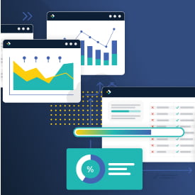
Visualization has been helping humans identify trends and patterns since primitive times. Modern-day data visualizations have the same guiding power.
They turn detailed datasets into compelling graphics that clearly illustrate trends, patterns, and other key insights hidden within company data.

The Benefits of Data Visualization
Creating compelling data visualizations allows you to understand the key takeaways behind your data much quicker than staring at never-ending columns and rows; plus, it makes it easier to take decisive action to correct errors, pursue opportunities, and get ahead of trends.
Here are just a few of the benefits of data visualization:
-
- Improve Clarity and Understanding
Data visualization simplifies complex data sets, making it easier for employees of various backgrounds and technical skill levels, from stakeholders to frontline workers, to understand trends, patterns, and insights. Visual representations provide a clear and concise way to communicate information, which improves collaboration, paves the way for new ideas, and ultimately leads to more informed decision-making. - Enhance Storytelling and Engagement
Data visualizations can tell engaging stories by combining data with narratives. Whether presenting to investors, clients, or internal teams, visualizations enhance storytelling and persuasion, making data more engaging and memorable. - Identify Trends and Patterns
By visualizing data in graphs, charts, maps, and more, businesses can quickly identify trends, patterns, and correlations that may not be apparent in raw data. Visualizations help organizations spot opportunities, anticipate market changes, and make predictions based on the latest data available. - Simplify Communication
Visualizations are powerful tools that transcend language barriers and technical jargon. They allow teams to communicate insights effectively, fostering collaboration and alignment throughout multiple departments, between stakeholders, and even across geographies. - Monitor Daily Numbers
With interactive dashboards and data visualization tools, businesses can track key metrics and performance indicators daily or even hourly. This agility enables proactive decision-making and helps employees respond swiftly to changing business and market conditions. - Spot Anomalies and Errors
Visualizations highlight anomalies, outliers, and data inconsistencies so users can identify errors and take corrective action promptly. Graphs, charts, and scatter plots make it easy for users to see everything from minor inconsistencies in daily performance to financial anomalies that may impact revenue if left unchecked.
- Improve Clarity and Understanding

Unlock the Power of Data Visualization
Are you ready to start using this powerful tool in your organization, or discover some new data visualization tips and tricks?
Watch our on-demand webinar to learn how you can enhance data storytelling with engaging visualizations inside TARGIT Decision Suite.