To extract the full value of your organization’s data, you need tools and processes that support data democratization: the process of putting data in the hands of your end-users so they can leverage it in their day-to-day tasks.
Data democracy expands business intelligence (BI) and analytics beyond your technology departments or a small team of analysts.
Instead of relying on a closed system, you’ll leverage the right mix of platforms and processes to make data more accessible and present relevant metrics to various business users — like salespeople, service technicians, marketing teams, and more.
A BI analytics dashboard paves the way for self-service BI in which users can extract and analyze insights for themselves, even if they aren’t statisticians or technical experts.
When configured and used correctly, these dashboards increase BI adoption and enable your teams to make data-driven decisions based on accurate, up-to-date information.
What is a BI Analytics Dashboard?
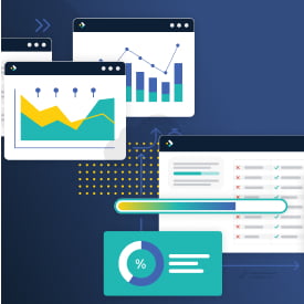
A BI analytics dashboard is an information management tool that uses data visualization to display various data points so users can assess their performance or progress.

In short, each dashboard creates a snapshot of related metrics to provide a high-level view of your entire business, a single department, or a specific process. Unlike detail-oriented reports, dashboards illustrate the big picture using various data visualization tools like charts or graphs.
The Purpose of a BI Analytics Dashboard
A BI analytics dashboard aims to communicate a robust collection of insights quickly and efficiently and focuses on the impacts or takeaways rather than the details behind each figure.
These dashboards are essential to an organization’s BI and analytics strategy. They’re designed to make large datasets digestible and inform decision-making. While most reports are static, web-based dashboards allow users to access, analyze, and share insights in real time.
The Difference Between Dashboards and Reports
While both are integral to a strong BI practice, several critical differences exist between dashboards and reports.
| Dashboards | Reports |
| Present analytics metrics and Key Performance Indicators (KPIs). | Present the data behind high-level metrics. |
| Summary-focused — can be understood with a brief overview. | Data-focused — require in-depth analysis to understand. |
| Include multiple data visualization elements. | Follow a tabular structure with detailed strings of data. |
| Web-based and highly interactive. | Static with little interactivity. |
While reports and dashboards often serve different purposes, your business may end up using them interchangeably. When either option accurately illustrates valuable insights, this decision usually comes down to the personal preferences of your stakeholders and key users.
What Should You Include in a BI Analytics Dashboard?
With a strong BI and analytics platform in place, you’ll be able to create custom dashboards for various teams and users within your organization.

The structure and content of each dashboard should be configured around specific goals and which datasets are most relevant to each team or user. Here are a few things to consider when you set up a new BI analytics dashboard:
Data Types
While each dashboard will be slightly different, here are some general ideas of what you might choose to include:
- Behavioral or performance metrics that relate to your products or services. For example, you can measure which products were most popular, which were most commonly purchased together, and how long your typical sales cycle lasted in each quarter.
- Relevant KPIs that drive value for the department or user accessing the dashboard. Examples include:
- Growth in Revenue
- Order Fill Rate
- Repair And Maintenance Cost/Revenue
- Service Tech Utilization
- Miscellaneous data that will inform decisions and strategies. Review customer demographics or evaluate their buying habits, like which channel drives the most sales or what time of day they’re most likely to make a purchase.
BI dashboards can include many data types, so it’s essential to configure each one around users’ needs, ensuring it presents actionable insights that tie back to goals or ongoing initiatives.
Visualization Options
Once you’ve decided which data to include in your BI analytics dashboard, you need to decide how you’ll present it to your end-users. Traditional dashboards offer various visualization components, including bar, column, or pie graphs and line, tree, or radar charts.
There’s no right or wrong way to present data within your dashboard. As you decide how to display your insights, consider which visualization options provide the most clarity around the data within them.
For example, you might choose a line graph to show KPI evolution over time, but opt for a pie chart to highlight the sales split between three or four of your target verticals.
Dashboard Design
Now it’s time to bring your metrics and visualizations together into a cohesive dashboard.
Each dashboard will look different based on what you’re presenting and how, but there are several best practices to keep in mind when you get into the dashboard development process:
- Keep your audience in mind. As discussed, the most valuable BI analytics dashboards include clear, relevant information for your end-users. Customize each dashboard so users only see what’s relevant to them.
- Provide context for your data. Without context, the numbers won’t mean much to those reviewing them. Always include valuable context, like timeline, scale, and historical data, so readers can understand the trends you’re highlighting.
- Steer clear of clutter. Just because you can include 12+ charts in each dashboard doesn’t mean you should. Remember, you can create several related dashboards if needed instead of packing everything into a single, confusing view.
At TARGIT, we believe successful BI practices put the power of data in the hands of all users, not just technical experts or data specialists.
We leverage decades of industry experience to help our customers implement BI best practices and build a culture around data democratization.
Our proprietary platform, TARGIT Decision Suite, is designed to increase user adoption and put the power of self-service BI in the hands of your business users.
Interested in learning more about TARGIT’s BI and analytics platform? Request a Demo