In today's competitive business landscape, harnessing the full potential of your Business Intelligence (BI) solution is paramount. A customized look and feel can be the key to unlocking new insights and helping end-users make decisions that propel your organization forward.
This is especially true for Plantorama, a Danish retail chain specializing in garden and home products. Plantorama has used TARGIT’s all-in-one BI and analytics solution for many years to streamline reporting and inform various business decisions.
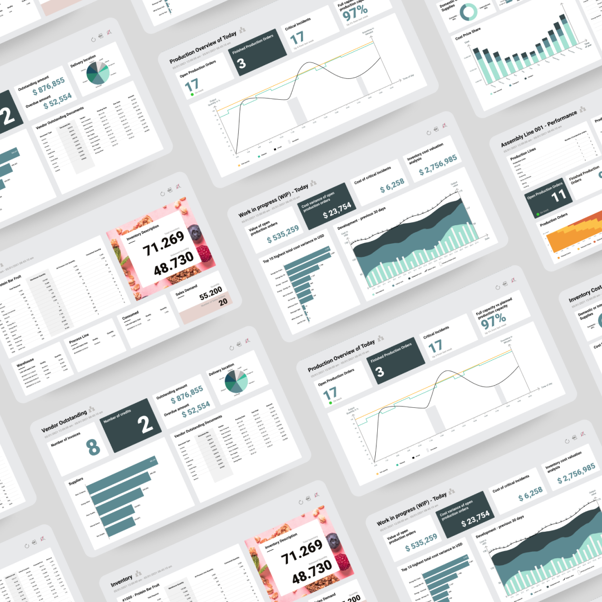
When Business Controller Lisbeth Odgaard Strand took over many of the TARGIT-related responsibilities within the organization, she quickly realized that Plantorama wasn't taking full advantage of their solution, particularly the available data visualization features inside of TARGIT Decision Suite.
So, Lisbeth began developing a design manual for Plantorama’s TARGIT solution that would define consistent colors, styles, and user experience (UX) patterns for every component inside the company’s BI dashboards.
In this blog post, we will explore how Plantorama customized the design of their TARGIT dashboards, allowing employees to unlock new insights and interact with company data more easily. We’ll share tips to keep in mind when customizing your BI dashboards and highlight specific examples and insights from Plantorama's experience.
Why Customize Your TARGIT Solution?
There are many reasons an organization may choose to invest in a design manual for their BI solution. Perhaps your teams have used the same basic templates for years, and the designs no longer align with your brand or end-user needs. Or maybe you’re just starting out with a new BI solution, and you want to implement design best practices from the get-go.
Every project will be unique based on your business goals, design requirements, and BI solution. Still, these are some reasons to consider layering custom design work on top of your business intelligence solution:
Introduce Consistent Branding
Your BI solution should be a seamless extension of your brand identity. Otherwise, it can feel disjointed for your users and make visualizations look out of place within other corporate materials, such as slide decks and emails.
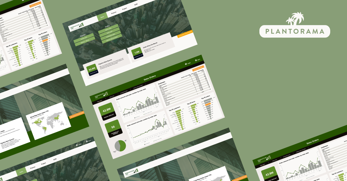
For example, Plantorama previously used yellow and black in their dashboards despite a green color scheme in all other parts of their business. Now, their design manual ensures that the company's brand identity is reflected in every report and dashboard they create in TARGIT.
Leverage New Features
BI solutions like TARGIT continuously evolve and roll out new features, both in the front and backend. Design customization and other routine updates allow you to harness these features to their fullest rather than letting valuable tools go unused.
In Plantorama’s case, the design manual project opened the doors for Lisbeth’s team to implement some of TARGIT’s newer front-end features, connect additional data sources, and explore the full extent of TARGIT’s customization options.
Enhance User Experience
Your BI solution should offer an intuitive and visually appealing user experience. A user-friendly interface fosters high user adoption and can entice long-time employees to actively engage with your solution, even if they have been standoffish in the past.
While TARGIT is already very user-friendly by nature, Plantorama’s design project allowed Lisbeth to adjust the layout of the interface to perfectly align with employees’ needs and the way they interact with company data.

Considerations When Creating a BI Design Manual
A design manual should introduce cohesive, standard guidelines for every element of your company’s BI dashboards, including font choices, background images, ready-to-use templates, and more.
Together, these items ensure a consistent and visually appealing experience for users, making it easier for them to interact with highly valuable data.
However, that doesn't mean your project lead should choose a color palette and specific features based on their personal preferences or an example they find online. Instead, each element should be designed to fit your business and the people who interact with your solution every day.
When contemplating a design project like Plantorama’s, consider the following:
- Ask for User Input: Don't underestimate the value of input from key figures within your organization. Get input from users at various levels of your operations to determine what functionalities and design elements should be integrated. You might learn about specific visualization needs from frontline employees. At the same time, the marketing team can give valuable insight into logos, color palettes, and other branding that will make your BI solution blend into the rest of your tech stack more seamlessly.
- Prioritize Overall Experience: Your design manual will primarily center on the look and feel of your BI dashboards – colors, fonts, icons, and KPI objects – but you should also consider the overall usability of your solution. Do users know how to access data quickly and easily? Is your menu or folder structure intuitive? Is it easy for users to get help if they have questions? If necessary, include navigation changes, interactive elements, and other UX enhancements within your design project to give your end-users the best BI experience possible.
- Make Purposeful Updates: Ensure that any updates or changes to your dashboards or BI interface serve a clear purpose. Then, communicate the reasons for each change, whether a new menu structure, updated button designs, or a revamp of your navigation, to your end-users so they’re aware of and ready to embrace the new designs.
- Leverage Outside Expertise and Support: Perhaps you need help finalizing the goals or milestones of your BI design project, or maybe you need outside support to develop and implement new design principles. No matter your unique needs, a dedicated BI partner or consultant can work alongside you to bring your project vision to life.
Level Up Your BI Practice with TARGIT’s Consulting Services
Branded, well-designed dashboards and reports drive high user adoption and help make your company data more accessible. Our team can help you enhance your TARGIT solution by implementing BI best practices, offering visualization walk-throughs, establishing data governance controls, developing a design manual, and much more.

Benefits of a Design Manual and Templated Dashboards
Plantorama's introduction of a comprehensive design manual and custom templates impacted users at multiple levels of the organization. Not only did it make results more accessible for business users, but it also sped up report generation while bringing consistency to every asset created inside of TARGIT.
Any type of design project will be helpful to your organization in many unique ways, but here are a few of the high-level benefits a design manual or similar project will deliver:
- Consistency: Design guidelines help give your reports and dashboards a consistent, on-brand look and feel, making it easier for people to recognize and understand them while strengthening your branding in presentations and other assets. They also help you establish a set of best practices for building reports, which will reduce the number of poorly designed reports circulating within your organization. Rather than being left to their own devices, users always have a clear jumping-off point and set of tools to guide report and dashboard creation.
- Visual Appeal: Clean, user-friendly designs not only enhance user experience but also generate excitement around the data you uncover through your BI solution. An aesthetically pleasing interface, plus well-designed reports and dashboards, contribute to higher adoption rates and make your results more engaging for different types of people.
- Scalability: A well-maintained design manual brings clarity and consistency to your BI solution, both of which make it easier to scale your BI operations over time. You can easily start creating reports for another department or add a new object to a specific dashboard without building these elements from the ground up. Plus, a comprehensive set of design rules also helps new users learn how to review, edit, and create dashboards efficiently and accurately.

See How Plantorama Achieves Sustainable Growth With TARGIT
Plantorama's design journey is a continuous one. Lisbeth is currently rolling out the new design manual to every department at the organization.
Next, she plans to start building new KPI objects with visual elements, like images and custom graphics, to replace some of the numbers-based objects in several of Plantorama’s performance dashboards. This strategy aims to increase user adoption and generate excitement around insights derived from TARGIT.
Interested in learning more about Plantorama’s TARGIT journey? Read the full customer story to see how this retailer has transformed operational decision-making with analytics.