
At TARGIT, we focus many discussions on the idea of turning insights into business impacts. This process begins with well-managed data warehouses and a business intelligence (BI) solution that organizations can use to analyze the data within those warehouses.
However, implementing a powerful BI solution is the first step to becoming a data-driven company. The journey from insight to impact goes far beyond simply making data available.
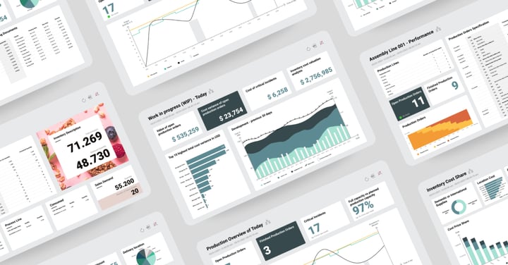
As organizations continue to create, collect, and analyze higher volumes of data, they need the ability to communicate it effectively. They must transform complex metrics into clear, easy-to-understand overviews that inspire business decisions and provide next-level visibility into business performance. That’s where data visualization charts come into play.
"Uncounted gigabytes of information are now available at a finger's touch on a keyboard, cached in digital memories, out of context. Our problem is not the scarcity of information, but the overwhelming challenge of sorting it, understanding it, and finding relevance, meaning and truth within data"
— Neil Gaiman, The Absolute Sandman, Vol. 1
Data visualizations have the potential to make the invisible visible, the complex readable, and the abstract concrete. They highlight important figures, illustrate trends, and provide viewers with actionable takeaways instead of asking them to draw conclusions from complex spreadsheets.
In this blog, we’ll share our favorite foundational tips for creating impactful, action-oriented data visualization charts that unlock new insights and inspire leadership teams to act on BI findings.
1. Standardize Look and Feel
Your organization likely takes active measures to create a consistent brand identity across channels. From your customer-facing website to internal messages, the look and feel of your platforms are valuable representations of your brand. Your visualizations and dashboards are yet another extension of your brand, which means they shouldn’t look generic or clash with your color palette or standard interface tools.
When you create visualization charts and BI dashboards, use elements from your brand’s design guide—like colors, font styles, and logos—to create a familiar experience for viewers. You can even involve your marketing team to ensure the dashboard and report templates in your BI platform tie back to your brand identity.
Beyond branding, consistent structural design across dashboards and analyses allows BI users to quickly identify trends or deviations and interpret new dashboards or findings more accurately when they’re first introduced.
Consider creating standard templates for visualizations or dashboards that promote self-service by allowing designers to plug in their own metrics. That way, all of your presentations match one another, positively reflect your brand, and make it easy for users to follow along.
2. Keep Things Clear and Concise
No matter the information on display, data visualization charts should turn complicated datasets into highly digestible illustrations. The dashboards that these charts appear within should clearly communicate an idea, trend, or insight in a way that everyone at your team meeting can absorb and understand quickly.
You have around ten seconds to convey findings in a dashboard before you lose readers’ attention, which means your data dashboards should be concise and focus on a few main ideas. Resist the temptation to fit as many charts as possible into a single view. Instead, use white space to break up big ideas and create focused dashboards that are easy to understand.
For example, you don’t need to show ten customer trends on a single dashboard or include all 100 data points on a chart or graph. Instead, identify a theme or goal for each dashboard and present data in a way that’s easiest for unfamiliar users to digest.
Finally, consider where you position data visualization charts within each dashboard. Charts and other information should be visible and laid out intuitively so users can focus on the most important information first.
3. Choose the Right Chart Type For Your Data
The impact of your data is determined by not just what information you present but how you present it. Most people naturally detect visual patterns and recognize specific formats and symbols across platforms—from a BI dashboard to an ad on social media. When you implement intuitive visual objects and patterns, your visualizations will quickly and efficiently communicate your message to end-users.
As you decide how to construct your data visualization charts, be intentional about formatting. Consider which chart options will provide the most clarity around the data they contain and match form to function at every opportunity. Here are some common use cases to keep in mind:
- Use bar charts to illustrate comparisons within a single measure
- Use line charts to display trends and recurring patterns
- Use scatter plots to present relationships between variables or distributions
- Use pie charts to show percentages and simple compositions of three to five elements

You might use a line chart to show how your equipment value has fluctuated over time, but you shouldn’t use it to present the sales split between your top five target verticals. In many cases, you can use multiple charts on a single dashboard to tell a complete story with your data.
4. Create Color-Coded Information Hierarchies
Color is a highly valuable visualization tool that can help you categorize different pieces of information and tie individual metrics to larger themes. However, adding color to your visualization charts doesn’t mean creating several disparate, multi-colored dashboards with no clear logic to back them up.
Use color with intention to strategically enhance, highlight, or clarify information. If you reference the same metric on multiple charts, use a common color to tie each appearance together. You can also use color to rank the importance or hierarchy of your data. For example, you might use three complementary shades of blue to group three lines on a line chart.
You might also use color to convey emotion or sentiment. In this case, you should lean on people’s familiarity with primary colors and the meaning of each. When appropriate, you might use green to present positive metrics and red to indicate negative ones. Or, you might use shades of yellow, orange, and red to indicate temperature on a heatmap. You can also keep it simple by using color to indicate positive metrics and a lack of color to indicate negative ones — or vice versa.

Above all, be consistent in how you apply colors across charts or values to help develop and strengthen patterns in the minds of your audience.
Bring Your BI Data to Life With TARGIT
Looking for more tips and recommendations on creating data visualization charts within TARGIT dashboards?
Part One of our TARGIT Implementation webinar series covers the ins and outs of dashboard setup and configuration inside of TARGIT.
Watch the on-demand recording now to hear our top tips for building charts and dashboards that support decisions on all levels of the organization.